Packaging and UX UI Design for New Moo Milk: A fictional plant-based milk brand.
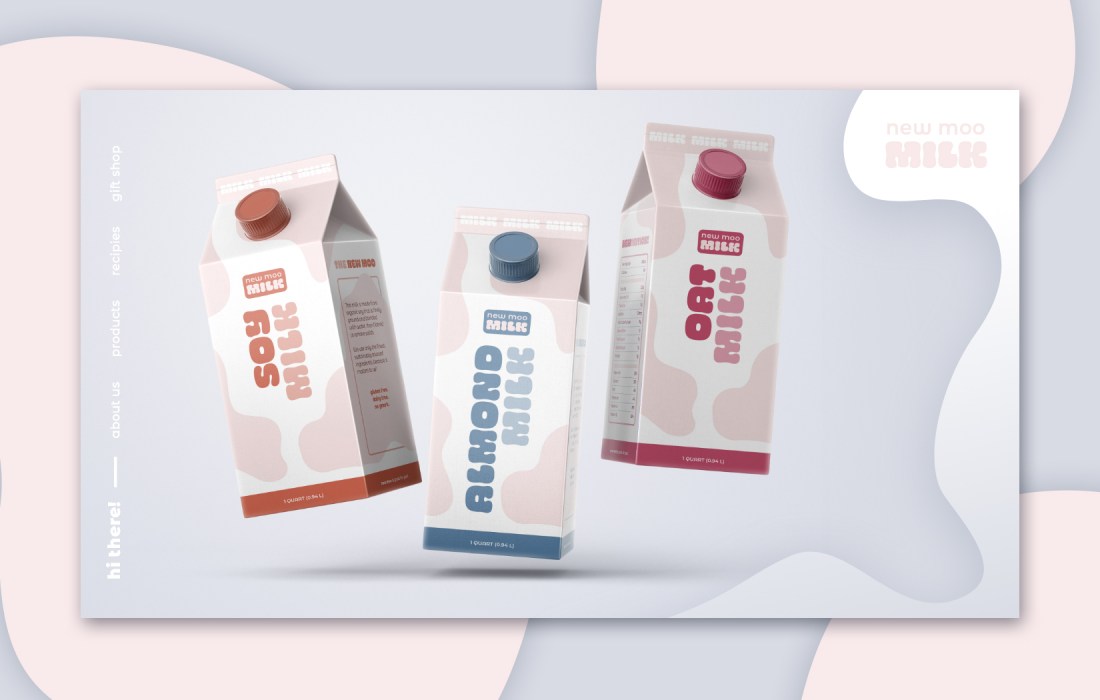
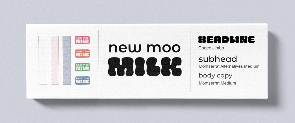
Packaging Design: The carton design combines funky type with organic shapes, which are meant to represent the distinct markings that are found on cows. By taking this direct relation to dairy milk and abstracting the meaning, this product combines what we think when we hear the word milk, and how that definition is changing and includes plant-based options.
Target Audience: Trying new things can be intimidating, especially when that something contradicts with our current opinions or understandings. New Moo Milk was designed to be straight-to-the-point, but playful. Large, bold type on the front of the carton makes it easily identifiable as to what it is. The friendly nature of the design is intended to make the consumer feel excited and open to trying the product.
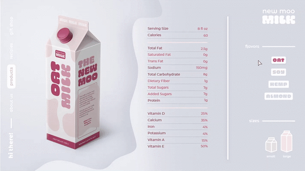
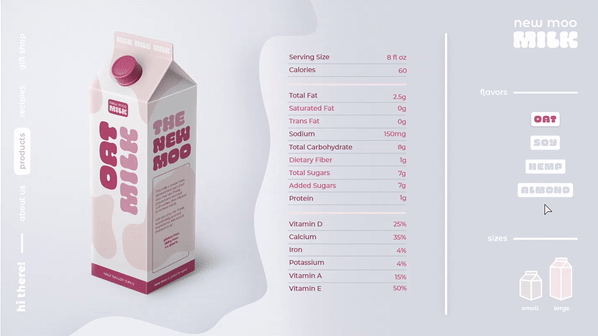
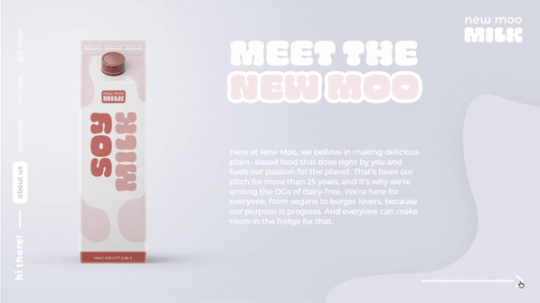
UX UI: Website design is minimal, but contains elements from the carton to show a direct relationship, such as organic shapes to frame text. To retain some of the playful nature of the physical carton design, simple but engaging transitional animations were developed.


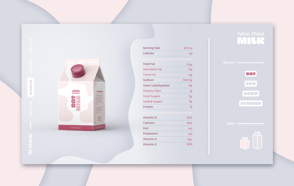

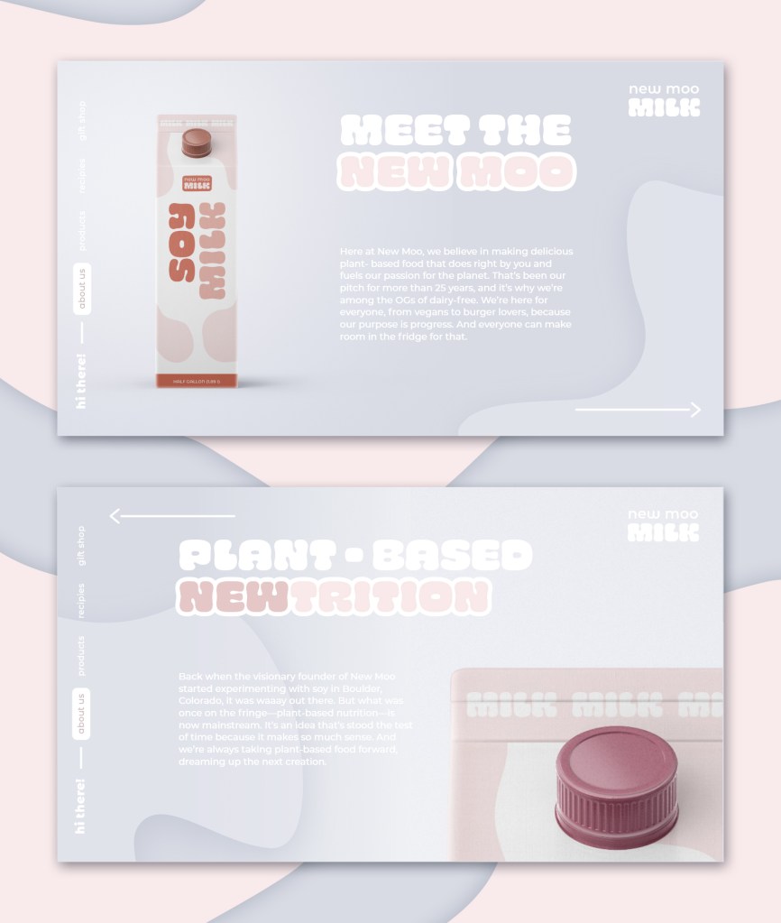
Interface Demonstrations